DC Energy.
Services:
visual identity.
Client description:
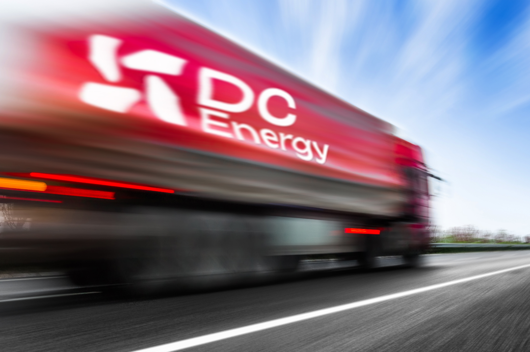
DC Energy is a fuel broker that provides customized solutions for companies operating vehicle fleets, helping them manage and optimize costs while streamlining the entire fueling process.
Challenge:
creating an identity that reflects the brand’s values and mission and serves as the foundation for its online presence, presentation materials, and future promotional efforts.
Solution:
The goal was to create a visual identity that contributes to building the brand’s reputation, increasing awareness, and distilling the brand into a coherent and relevant visual presence for its target audience.
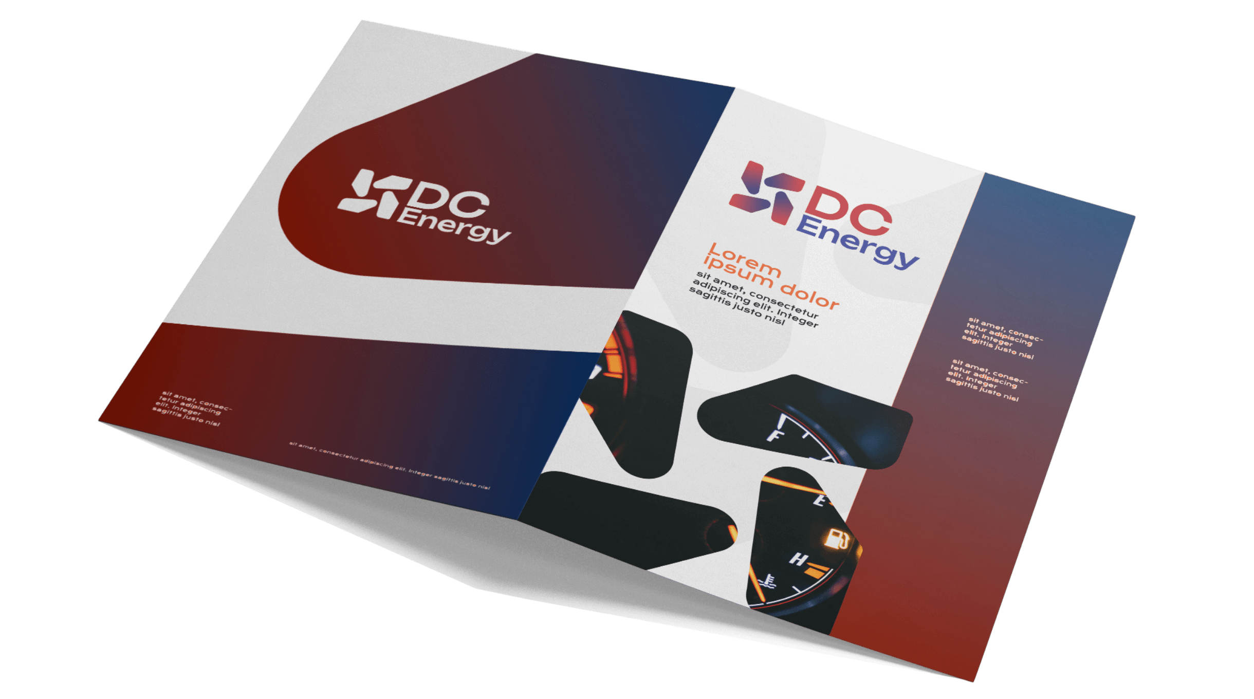
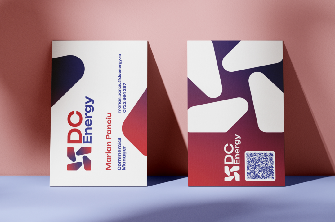
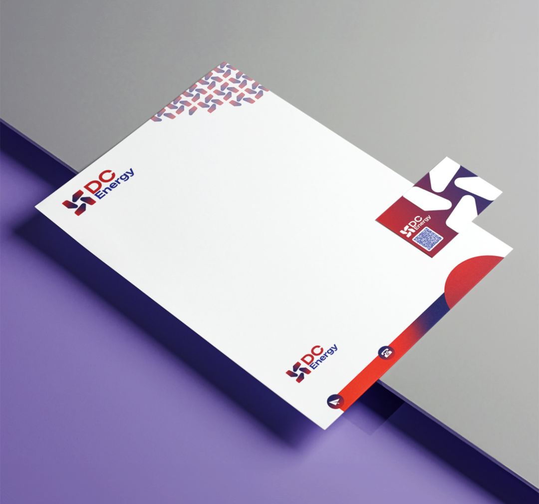
The winning proposal was defined by a bold, compact, and memorable graphic style that conveys closeness, energy, warmth, and stability.
The logo features an alternation of warm and cool colors, representing the perfect balance between client proximity and the professionalism of DC Energy’s services.
The symbol is enclosed within a square shape, conveying stability and trust for the client.

The symmetry between the elements of the symbol and the construction of the typography creates a dynamic and impactful logo. Together, the elements form a cohesive whole, conveying the idea of energy and movement.
At the same time, the fact that the shapes are equal, mirrored, and in motion suggests the control and customization offered for each individual project, as well as the brand’s flexibility in adapting to client requirements.
The visual identity was later extended into presentation materials and the website.