
Four seasons.
Four Seasons: a visual identity built around play, creativity, and belonging
For the branding project created for Four Seasons, we developed a visual identity that reflects the energy, safety, and emotion of a space dedicated to children and families.
The concept was designed for a brand that combines the idea of a playground and café into a warm, friendly, and memorable experience.
The creative process started from the values that define the brand (family, community, creativity, play, and connection), while the proposed directions aimed to create a balance between the spontaneity of childhood and the sense of trust that such a space should inspire in parents.
Slogan:
- a slogan that instantly captures attention through the composition of three elements: fun, play, time.
- the repetition of the word “more” immediately sets expectations: more, better, higher quality.
- by using the “rule of three” technique, we attract attention while subtly and creatively presenting the Four Seasons offering:
- fun and play for children
- time for adults or for the whole family together
Logo:
We developed several logo concepts, each exploring a different perspective on the brand’s identity:
- a playful and asymmetrical direction, inspired by the spontaneity of play and children’s imagination
- a modern typographic concept designed as a flexible and memorable visual signature
- an expressive identity based on symbols associated with the seasons and the idea of exploration
- an organic and approachable variation, built through warm and authentic shapes
- a geometric and contemporary direction, transforming letters into a balanced and adaptable visual play.
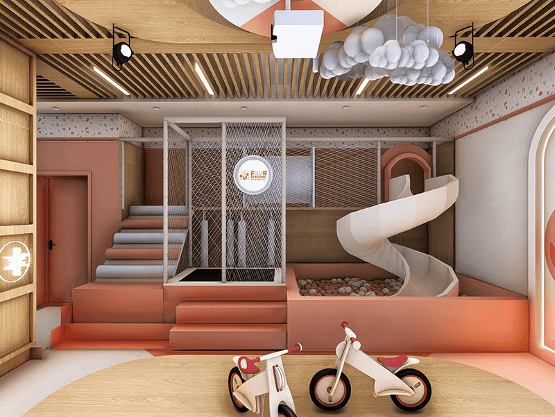
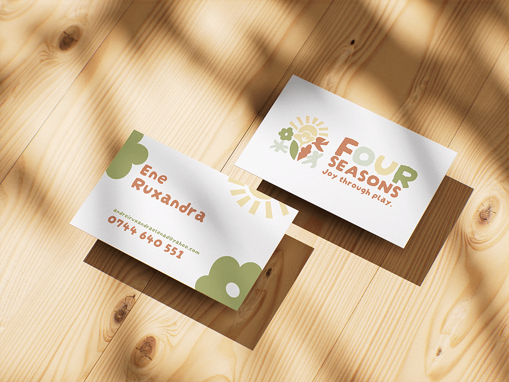
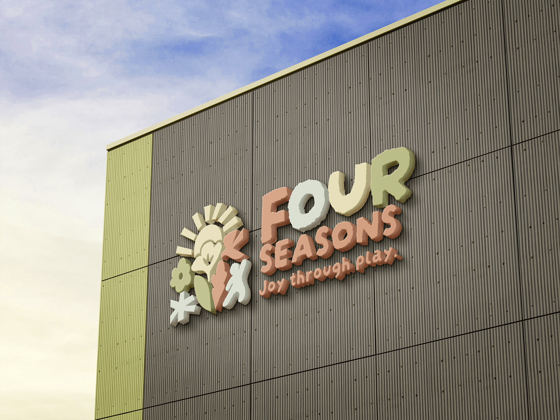
In developing the identity, we used warm colors, organic shapes, and friendly contrasts to create an accessible and energetic visual universe. The graphic elements were designed to function seamlessly both in the physical space and across digital communication, maintaining brand consistency in every context.
The final result is a visual identity that transforms Four Seasons into an approachable and memorable brand: a space where children explore through play, while families find comfort, energy, and connection.
- This logo offers the viewer a playful interaction of colors. The symbol is built from elements specific to each season and the silhouette of a child directed toward the name, toward the future.
- The graphic style of both the typography and the symbol resembles a drawing made with wax crayons. The outline is irregular, while the elements within the symbol have an organic, simple form — creating a warm visual feeling, as if it had been designed by a child.
- The letterforms convey creativity, energy, and inner strength through their thickness and arrangement.
- The slogan strongly reinforces the message of the entire visual identity. The foundational shape in which the symbolic elements are arranged is a dome.
- A recurring architectural element throughout the space, the dome highlights the changing seasons across the different areas.