(formerly) Fire Protection, (renamed) Welkins.
Services:
positioning, naming, visual identity, brand guidelines, business cards.
Client description:
Fire Protection is a local manufacturer of smoke exhaust dampers. The company has been operating in the Romanian market since 2013 and has worked with Auchan, Sema Park, Coca-Cola Ploiești, and Pizza Hut.
Challenge:
With a consistent and respected presence both nationally and internationally, the Fire Protection team realized that its original identity—including its positioning, name, logo, and slogan—no longer accurately reflected the brand’s values. That is why they turned to Connect Media to create a relevant and unique positioning for them, as well as a new identity (name, logo, and slogan).
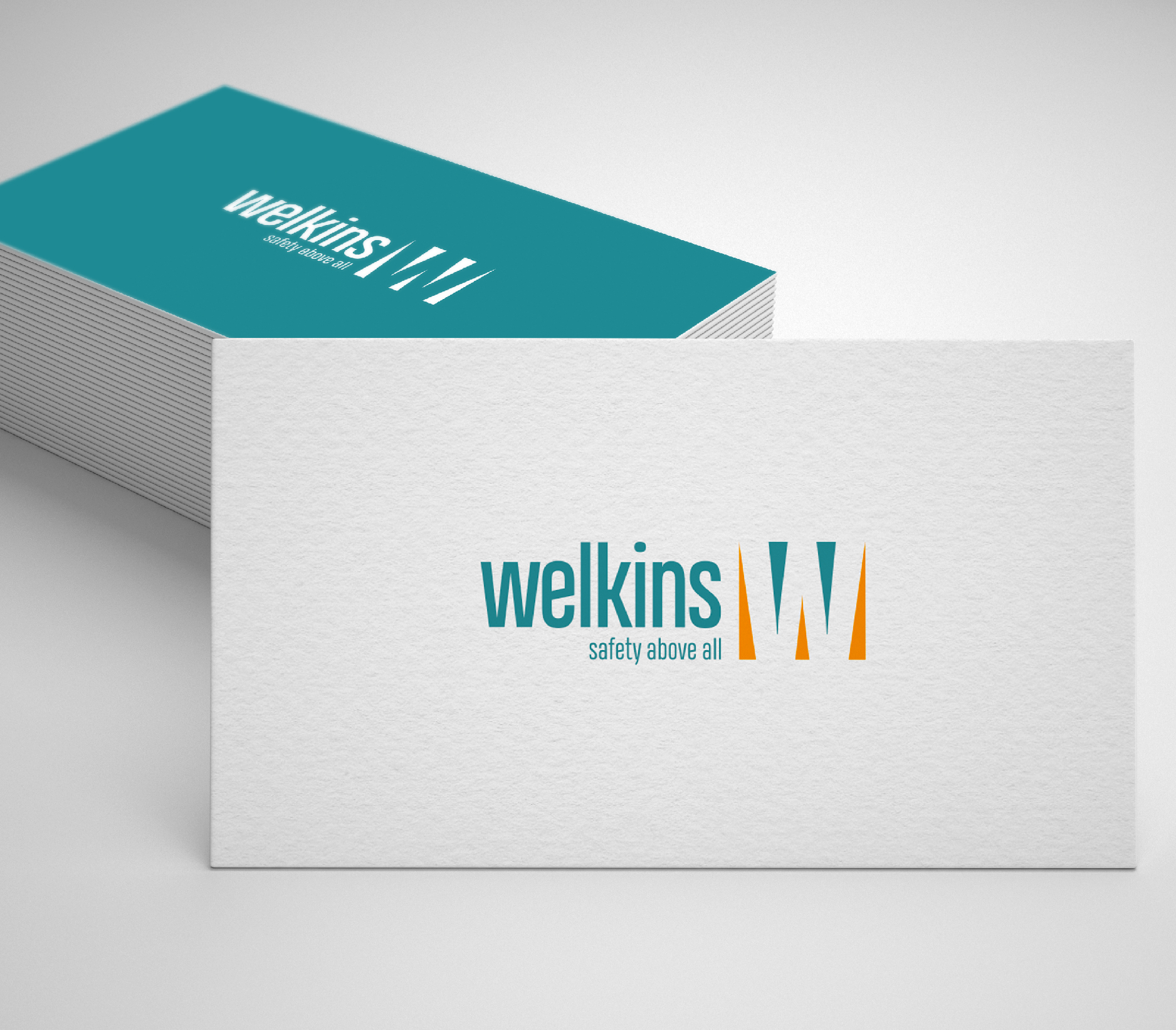
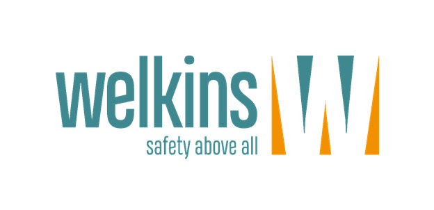
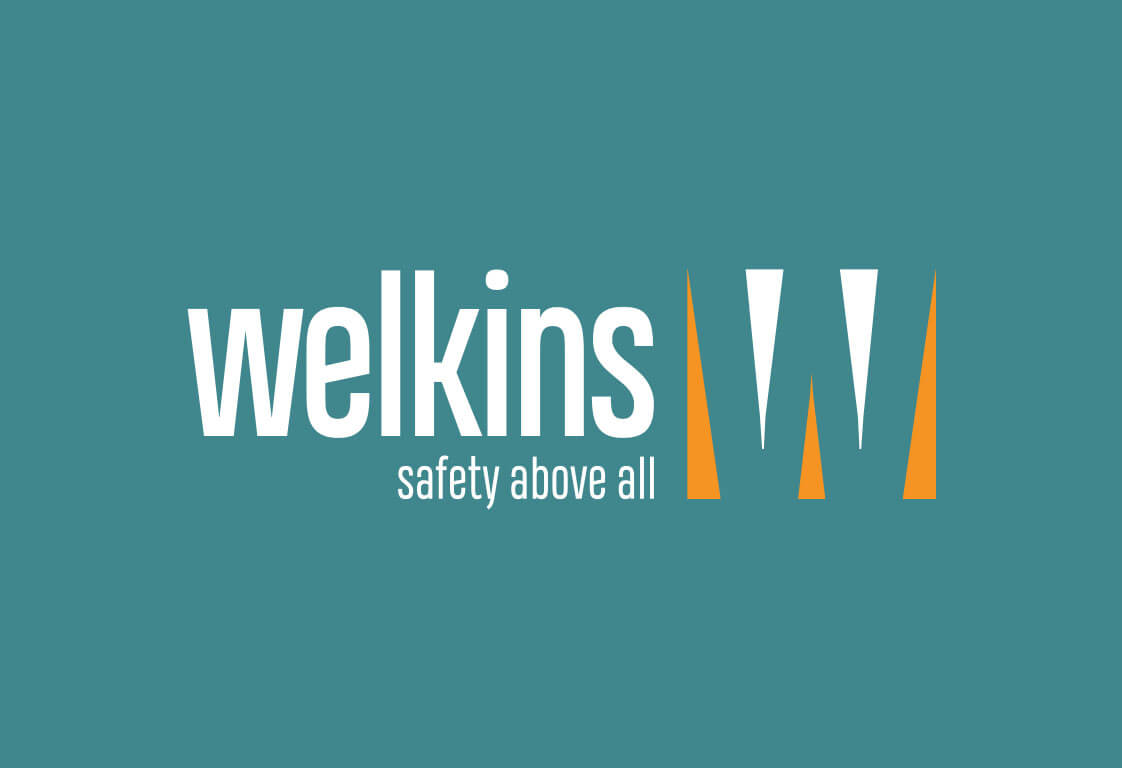
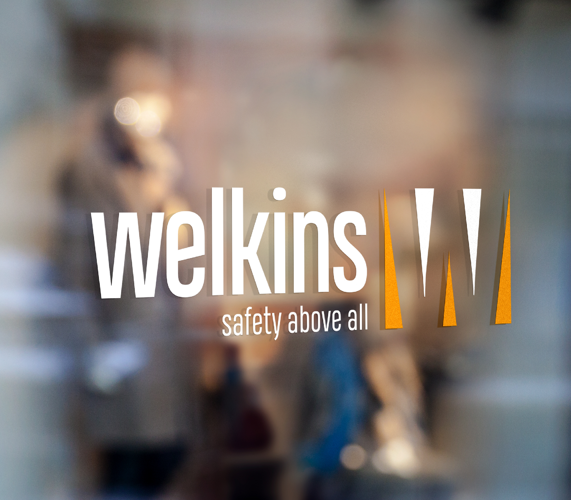
VISUAL IDENTITY: LOGO
LOGO+SLOGAN: The client was presented with three logo options and three slogan options. The selected options are listed below:
Slogan: Safety Above All
The defining characteristic of SHEV systems is safety — whether we are talking about people, assets, or investments.
The proposed and selected slogan carries a double meaning:
- Safety above everything
It describes the physical placement of the brand’s products, which are usually positioned on top of buildings and facilities. It is also a slogan that is easy to understand even for beginner English speakers.
- Safety first
It represents a clear commitment that sums up all the brand’s values. At the same time, it reminds clients that safety should also be their primary objective.
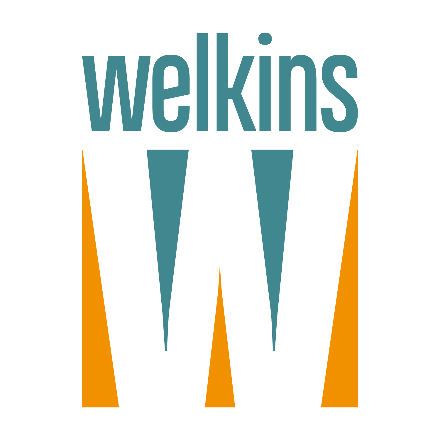
LOGO:
By using a font with tall vertical proportions (heading-style typography), we immediately suggest the idea of height associated with the brand name.
The avoidance of uppercase lettering is balanced by the visual symbol, which cleverly and intuitively integrates the letter “W”.
The symbol also visually represents Welkins’ activity and the core idea defined by the positioning and slogan: the systems provided by the company create that essential breathing space — the fresh air needed for safe evacuation in case of fire.
The “W” created through negative space separates the warm color at the bottom (fire, danger) from the cool color in the upper section (coolness, fresh air, safety).
In this way, the brand’s initial transforms into the very mechanism that guarantees the company’s core promise: safety.
Keywords: trust, safety, stability, solutions, quality.
MARKET POSITIONING
Accepted proposal: As indispensable as air.
The brand’s main emotional benefit is safety — the defining element of this industry and the main driving force behind its products: safety for both people and property, as well as peace of mind for the owner or entrepreneur.
We breathe approximately 23,000 times a day — air is the essential element without which a person cannot survive for more than a few minutes. This is why, in the event of a fire, many deaths and material damages are caused by the lack of air: people lose consciousness, mass panic occurs, and emergency teams are unable to intervene in an organized manner.
Fire protection products are the elements that can make the difference between life and death, between minor damage and major financial disasters. They provide the precious air needed for safe evacuation and for specialized emergency teams to intervene effectively.
Smoke vents have now become an essential part of any construction and are a legal requirement.
The purpose of this positioning is to communicate to the end client that smoke vents guarantee safety for both people and property, and can help reduce the consequences of a fire — in short, for a safe project, smoke vents are just as indispensable as the air we breathe.
NAMING
Accepted proposal: WELKINS.
Originating from the 12th century, “welkin” is an English noun referring to the vault of the sky. It is instantly associated with the idea of physical and moral elevation (the vaulted ceilings of cathedrals were called “welkin”), as well as with an impressive achievement.
Taken literally, “welkin” represents the highest point of a building — exactly the place where the brand’s products are installed.
The proposed and selected name is easy to remember, has an international resonance, and creates an emotional impact associated with a company backed by tradition.
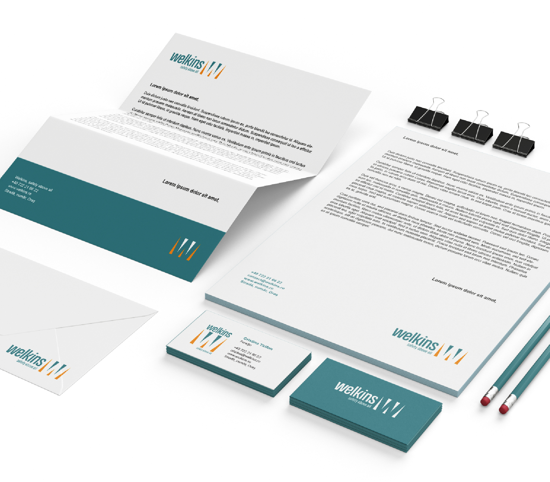
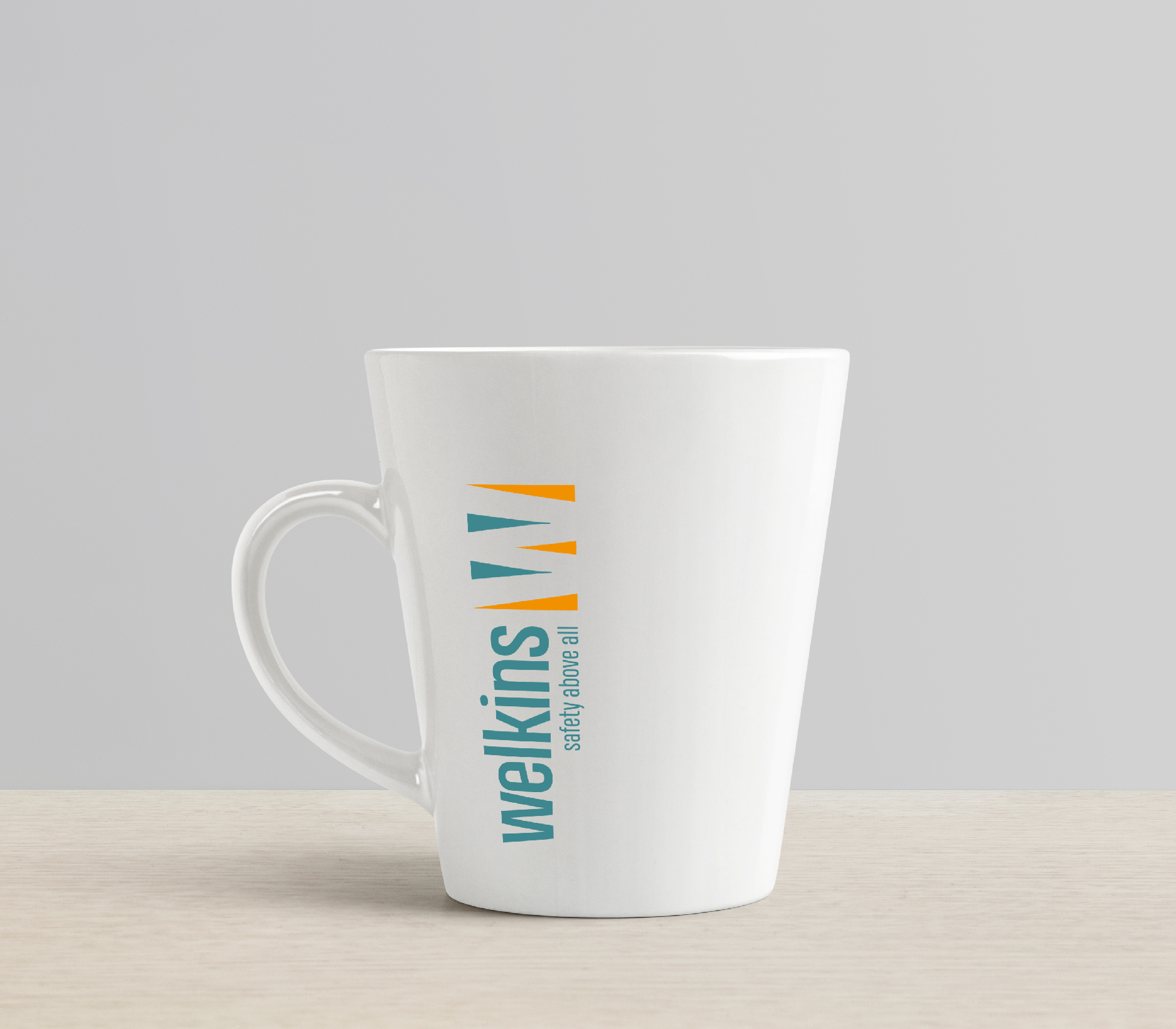
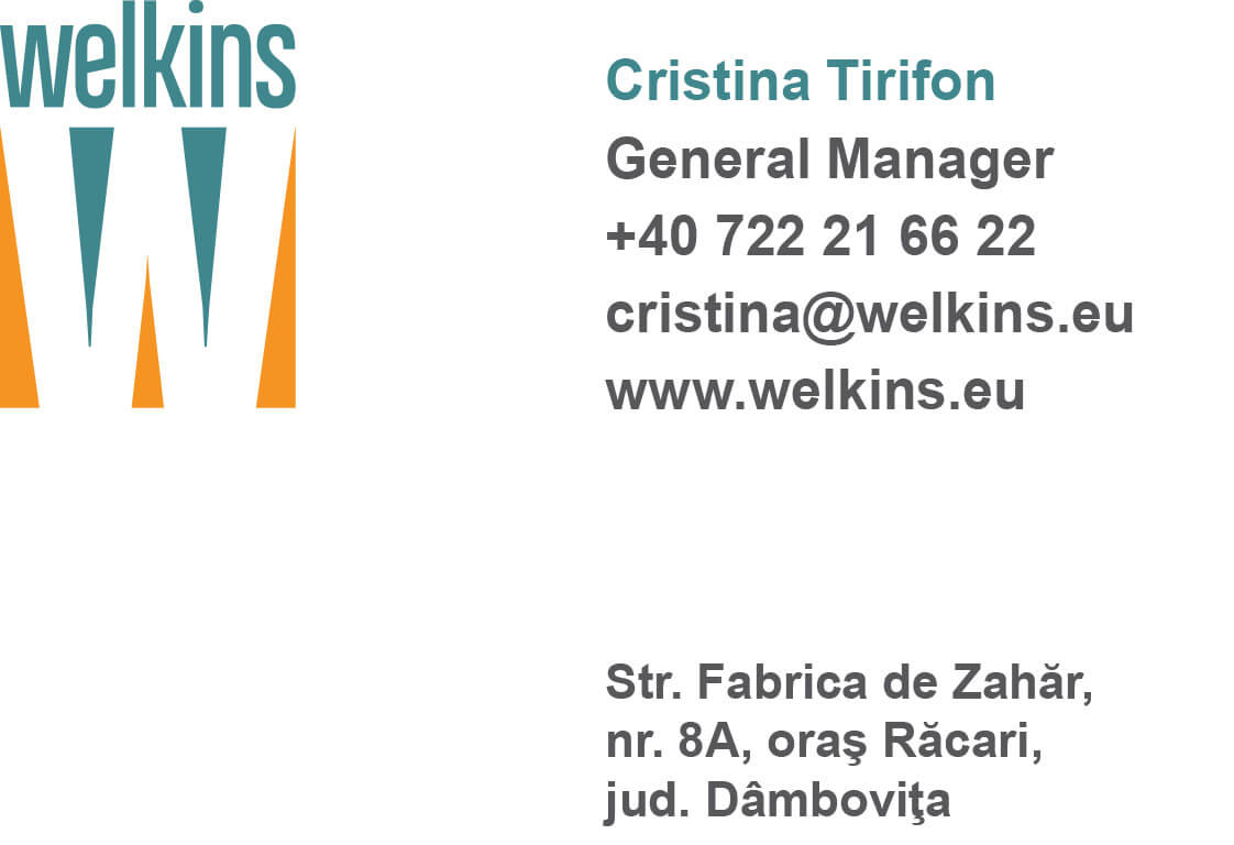
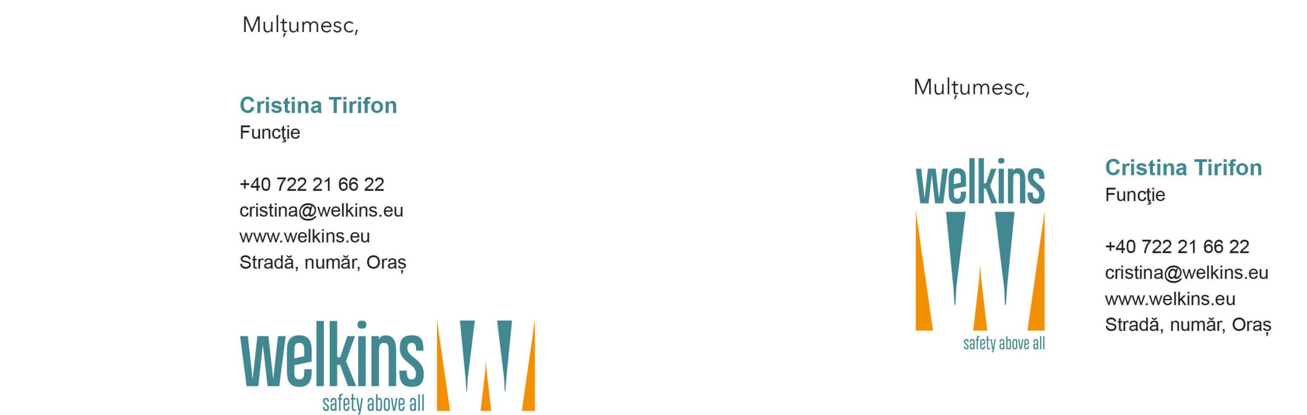
PRESENTATION MATERIALS